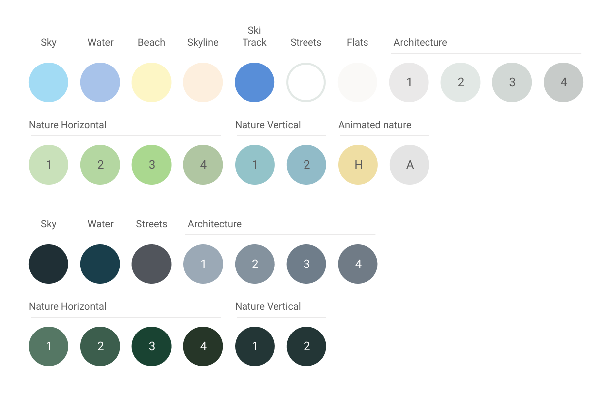
Tatara Color System
Series study
2015 – The Beginning
The starting point of my Color System (Previously called GMCC) concept was Piet Mondrian’s „New York” period. His approach to modernity and crowded city life in general. I was looking at readymade IKEA canvas that is available to purchase around the world. Asking myself:
„How He (Mondrian) would do his Broadway Boogie Woogie series nowadays?”
Been able to scroll around the city map view from above in many different ways using just a device in his hand.
„How he would do that?”
I came up with the idea of “digital reverse processing”. The visible form of showing content (landscape) using cyberspace language (color system) on plain canvas.
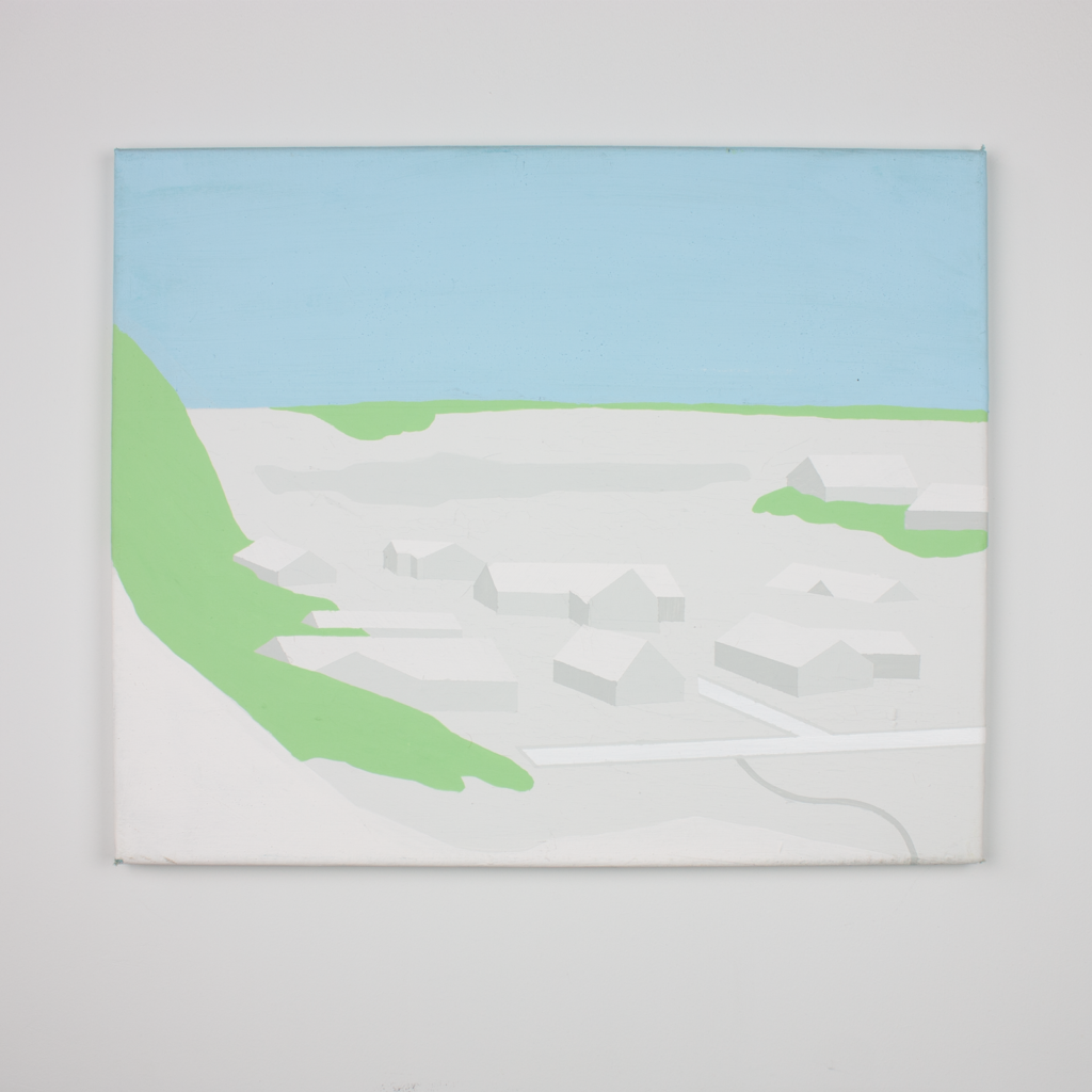
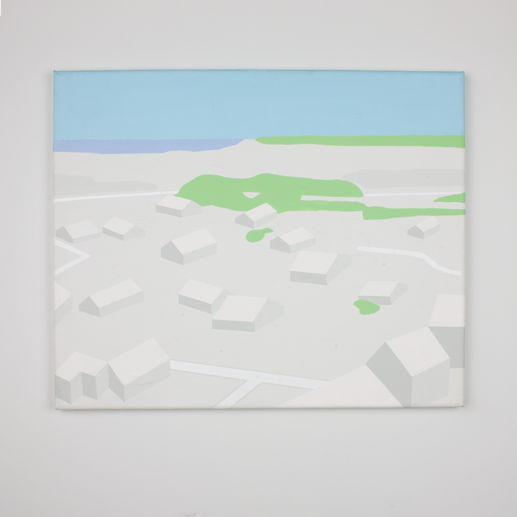
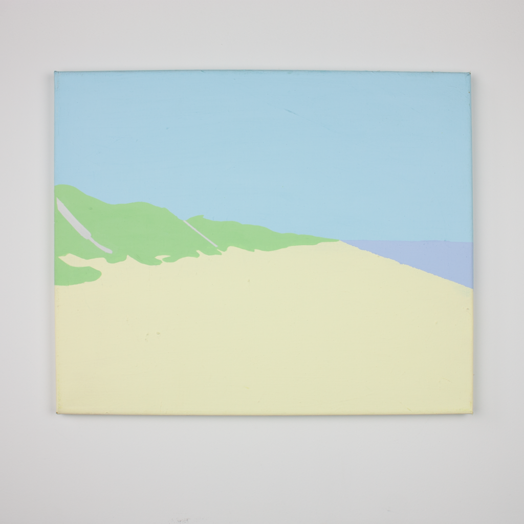
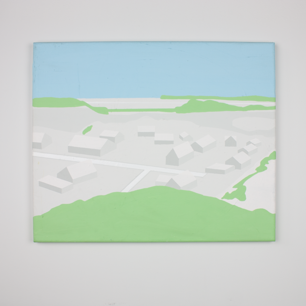
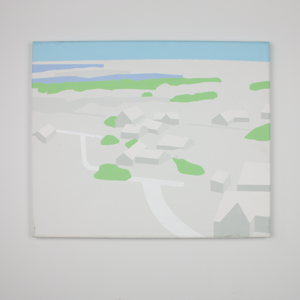
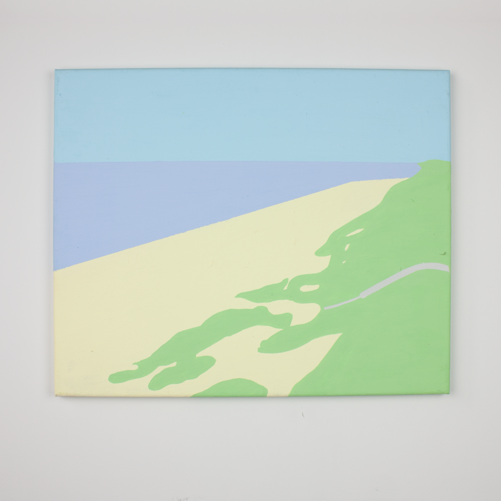
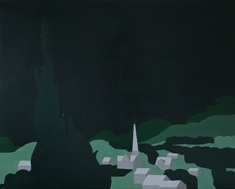
2015 – Bjerregård
I started the TCS series in Denmark by painting with a limited range of colors, a series of coastal landscapes of the city of Bierregard. I choose small landscape samples that would include buildings, beaches, streets, the sea, and also green space. Satisfied with the results of my studies I decided to go to the next stage of the project in which I could choose how to set up specific colors in created image.
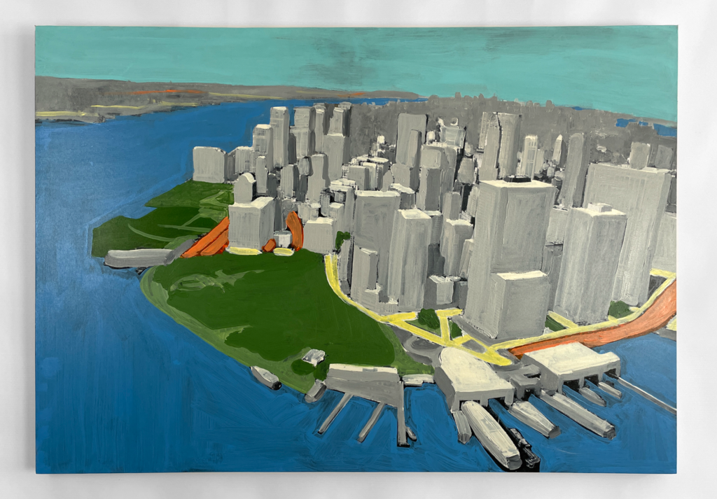
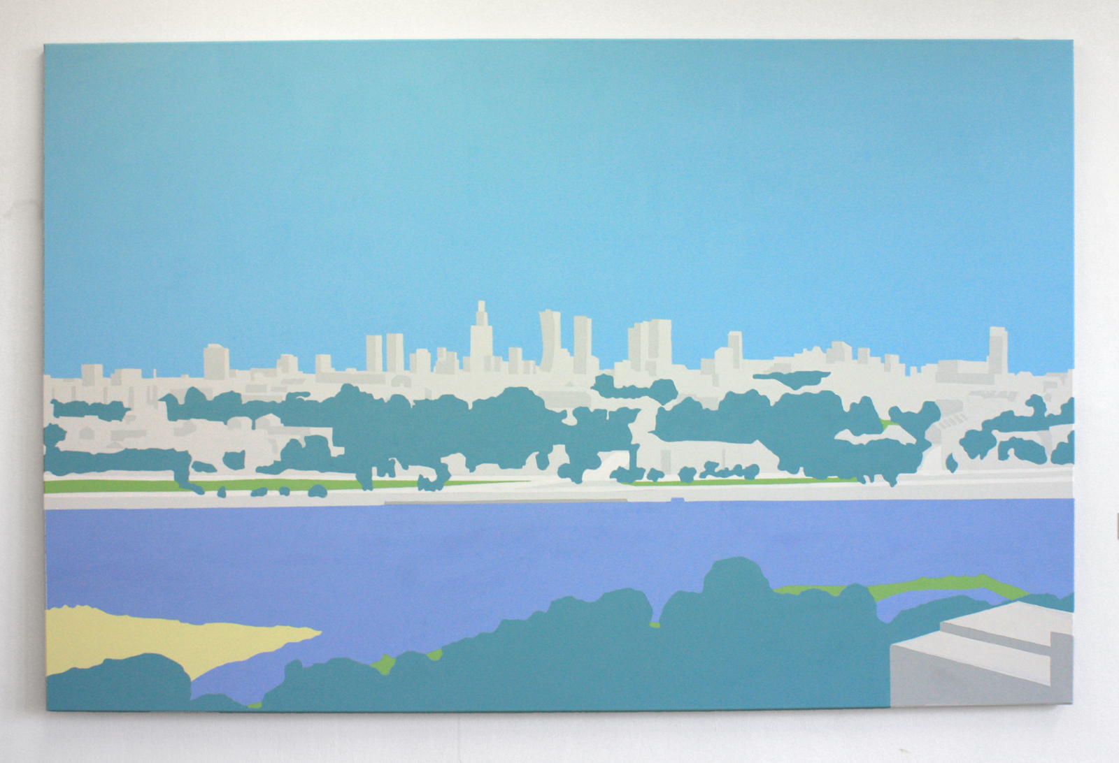
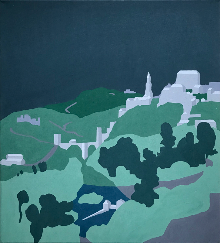
2016 – Warsaw
Warsaw skyline was the next step I decide to take in the development of my project. The difference was a topic, a bigger scale, and a more complex relation between architecture and nature. The possibility of referring in painting to both the foreground and the background images using swatches representation. Also, I decided to add a new color for the vertical nature and choose a bigger canvas format for that piece (200×130 cm). At the same time, I’ve made a few smaller studies of city structures seen from the window of my studio.
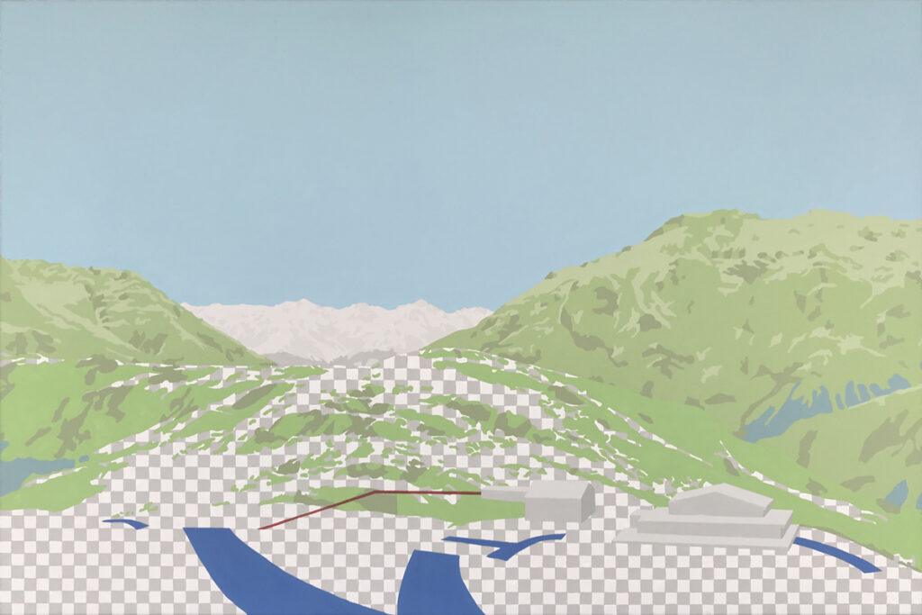
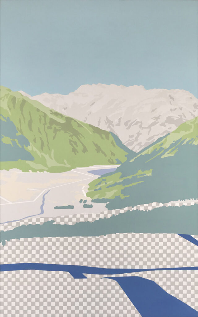
2017 – Livigno
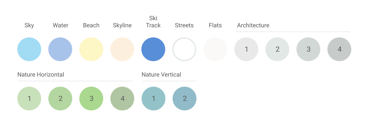
Satisfied with the outcome of previous studies I extend my color palette to 16 colors enriching green parts in the foreground and grayscale in the background of the landscape. Additionally, the first time I used a swatch to symbolize „snow”. The creation of these three mountain views of the Italian Alps gave me the opportunity to apply all the previous methods that I developed in the previously created paintings. In addition, enriching the image with ski runs and lines of the cable car. As they are also present on GPS maps view. (From this point, it’s just one step to create a color swatch representation for air or sea routes)

2018 – Dark Mode
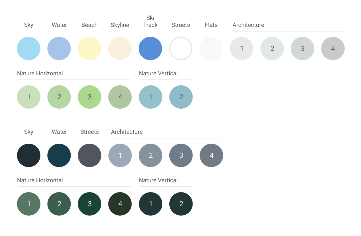
At this point, I was quite ready to create a “dark mode” for my color system. Again I used Web Maps as a reference in dark mode with minor adjustments of the night sky and vertical green. This time as an object of my studies, I choose famous nocturns created by masters of paintings. El Greco, Van Gogh and Matisse. An additional aspect was the dimension of an artwork. I want to keep the exact as the original one to detect how the postprocessing will affect the original image. Have in mind that all those artworks are still landscapes. Although colors or screens look good and crispy it was challenging to convert them to NCS (Natural Color System), and some of the color tones still need some lab updates.
“Toledo” acrylic on canvas 43×48 cm – 2018
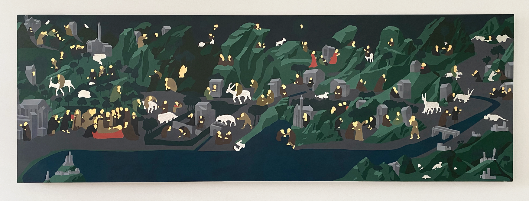
2019 – Human Figure
What would be landscape without human figures? Collecting all my experience I had to decide how to treat the human body and how to treat other living creatures in my Color System. I decided to use flakes of gold in body skin areas and outline animal figures with silver leaves. The perfect “excuse” to try this method was Fra Angelico’s horizontal panel hanging in the Uffizi Gallery in Florance as a reference. The combination of landscape with dimensional form and animals with human figures. Of course, I had to create a range of color swatches for clothes. The original painting itself directly inspired them and also I kept the same size of the panel (72×220 cm). The final result was an interesting impression of glowing reflecting light through “human existence”.
2020 – and beyond
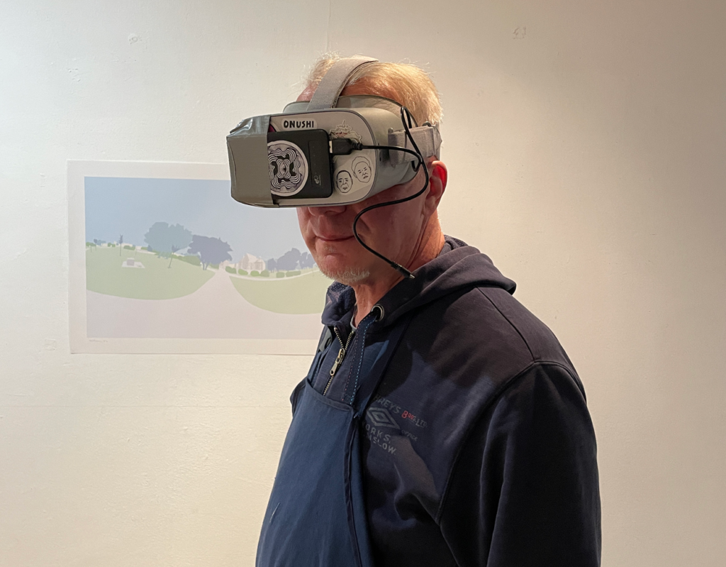
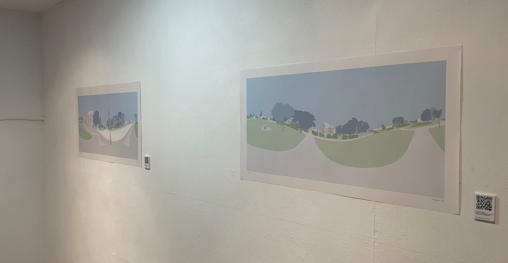
As the main core of colors is generated at this point I am focusing on spreading my Color system to other fields. Not just landscapes but also portraits and virtual reality spheres where I implement all the rules. Some of them you can check on your phone in 360 mode here and here. Tbc…